SYNT | Building a Bold Tech Brand Identity
SYNT brand identity is a bold visual system designed to reflect speed, precision, and clarity for a tech-driven company.
SYNT | Systems That Sync, Teams That Ship — Tech Brand Identity
The Brief
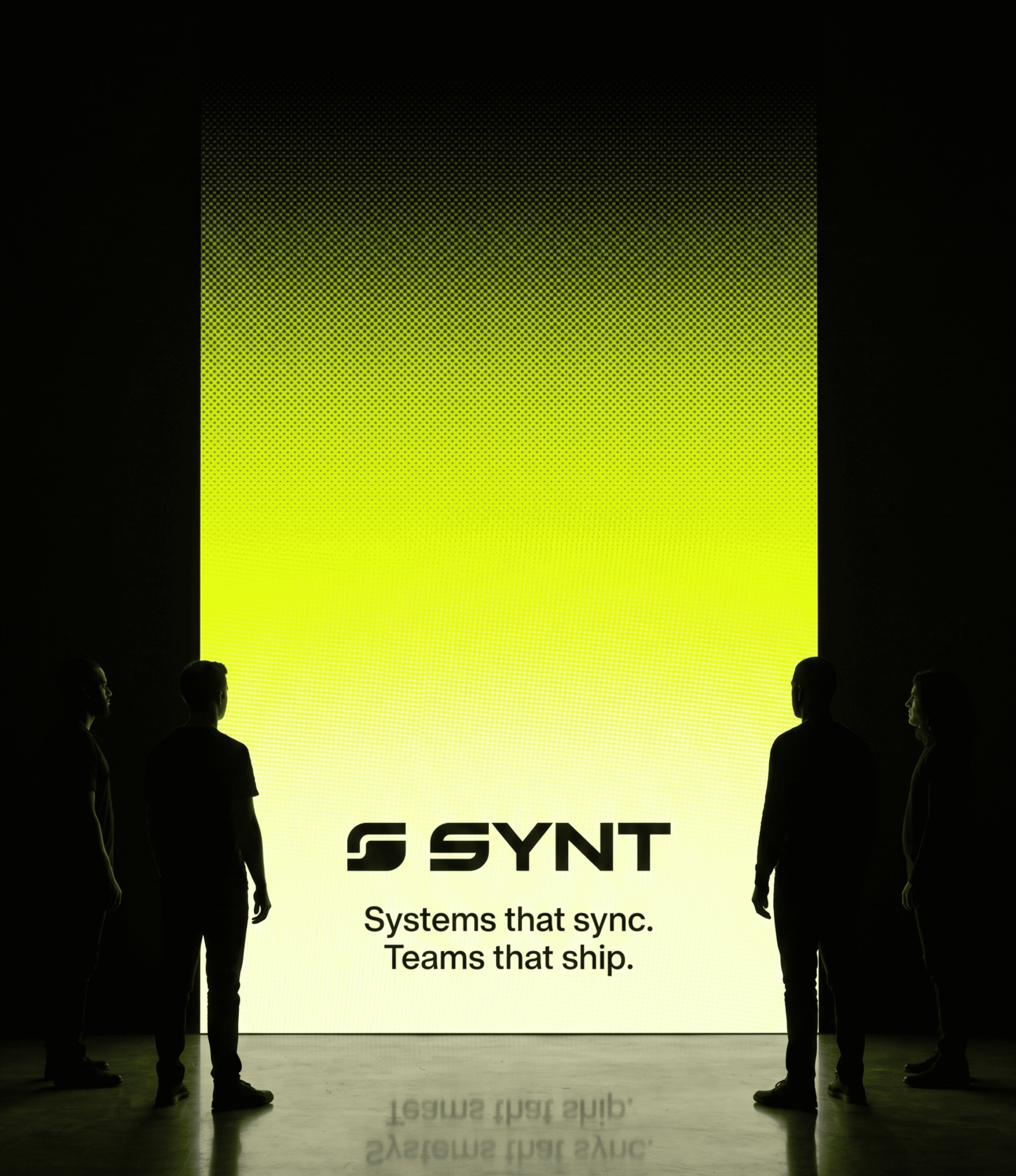
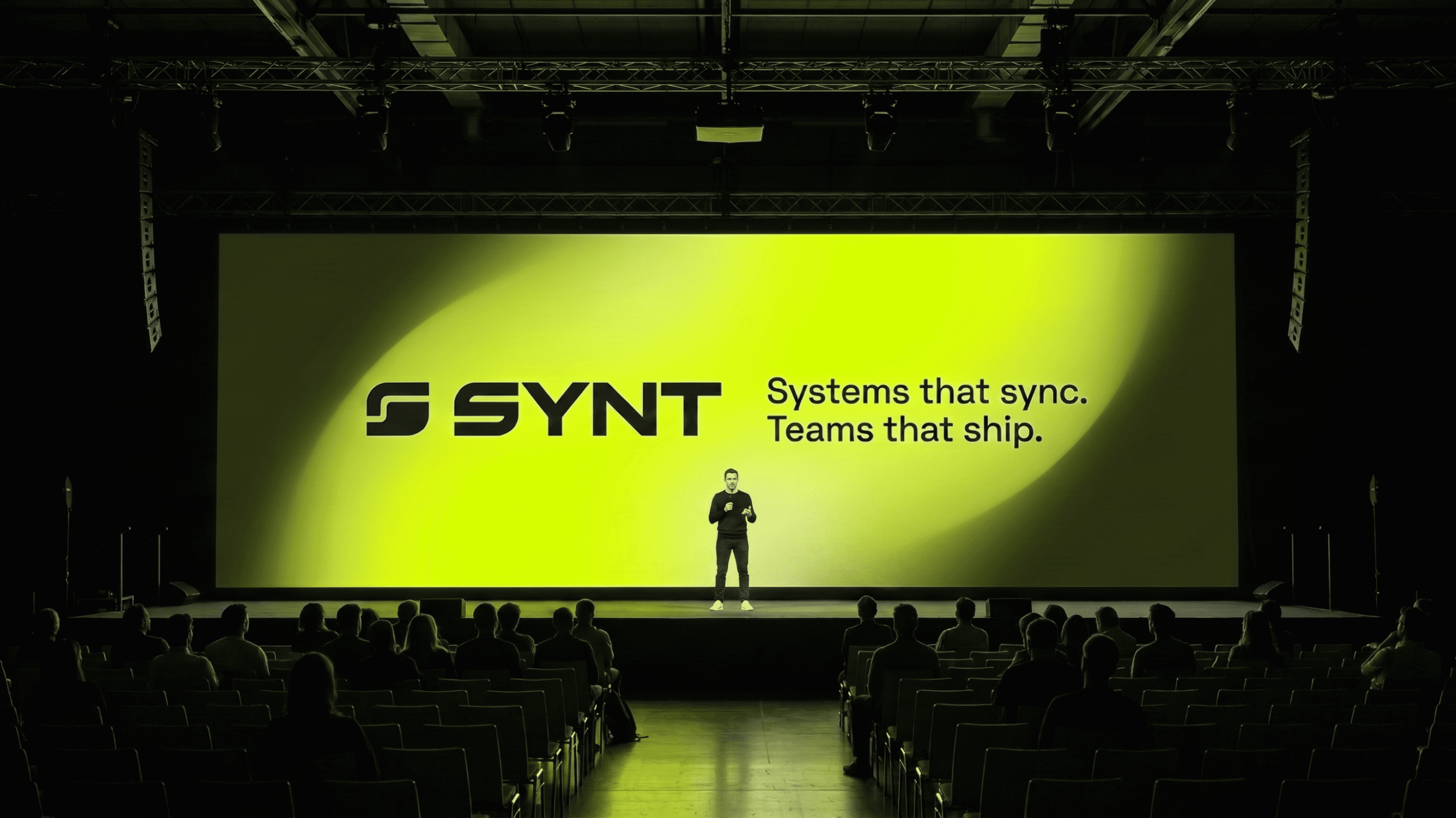
SYNT needed a brand that could speak to enterprise clients while staying visually distinct in a crowded tech space. Additionally, their tagline, “Systems that sync, teams that ship,” had to translate into every touchpoint — from digital assets to physical merchandise.
Brand Strategy
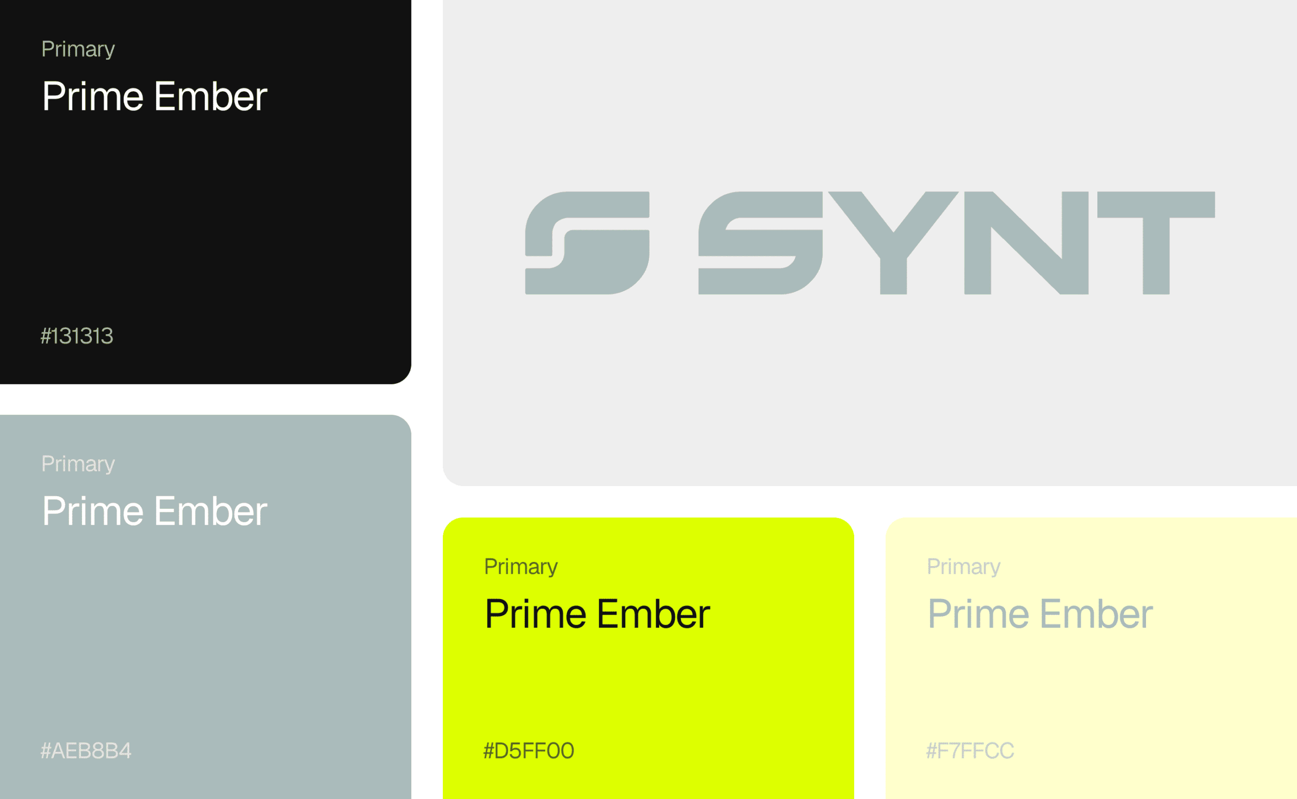
We built SYNT’s identity around three pillars: precision, energy, and clarity. As a result, the design system is anchored by a sharp geometric logomark and a striking neon-yellow-on-black palette that commands attention without losing professionalism.
Applications
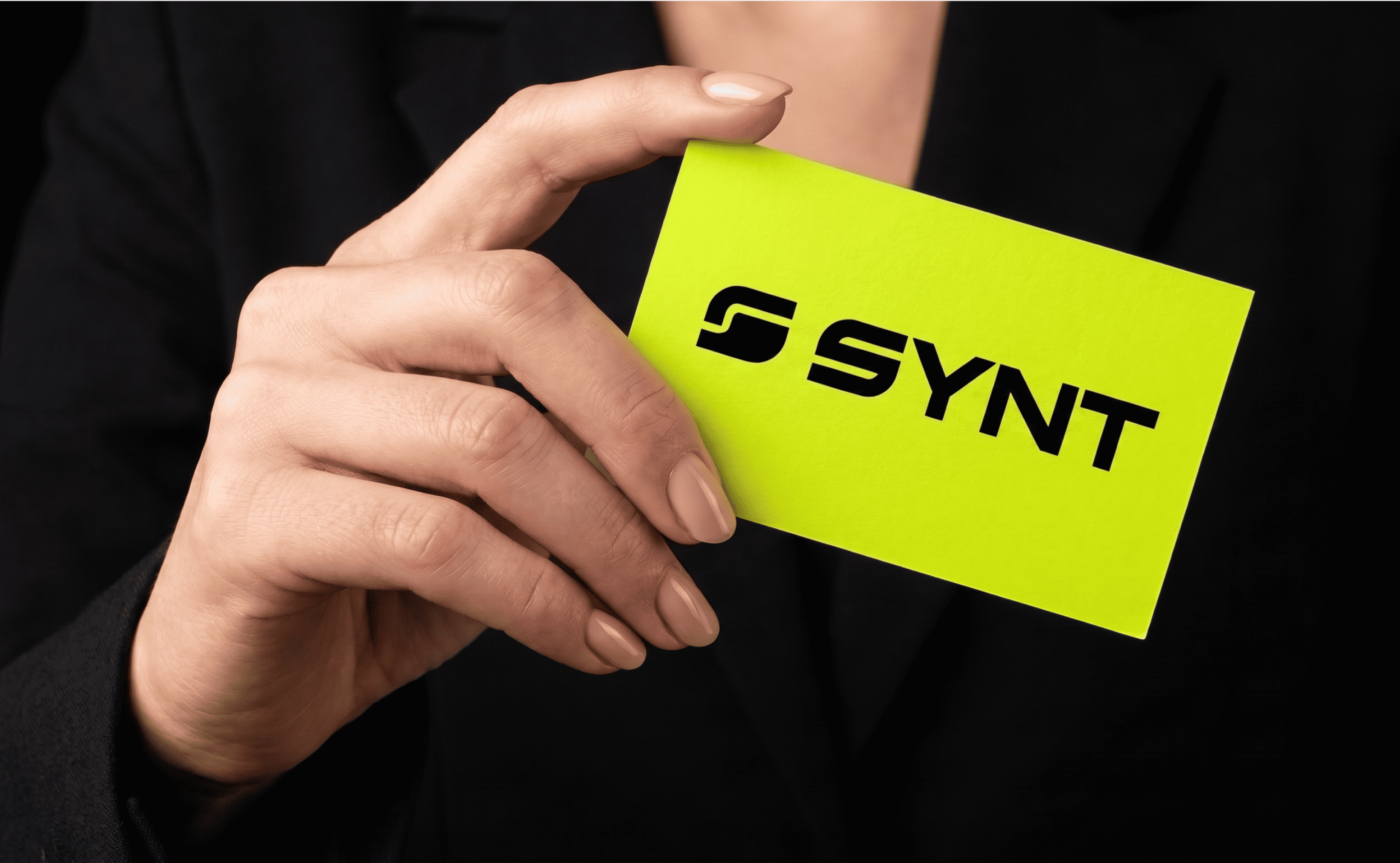
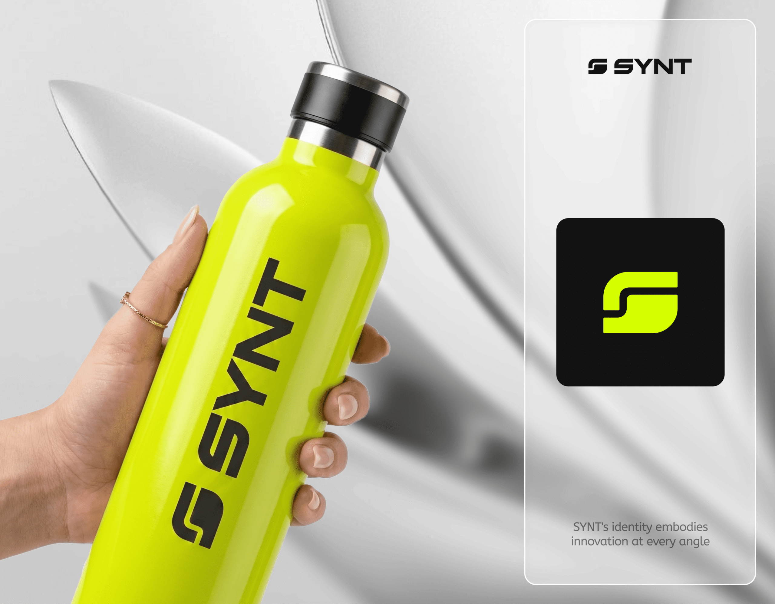
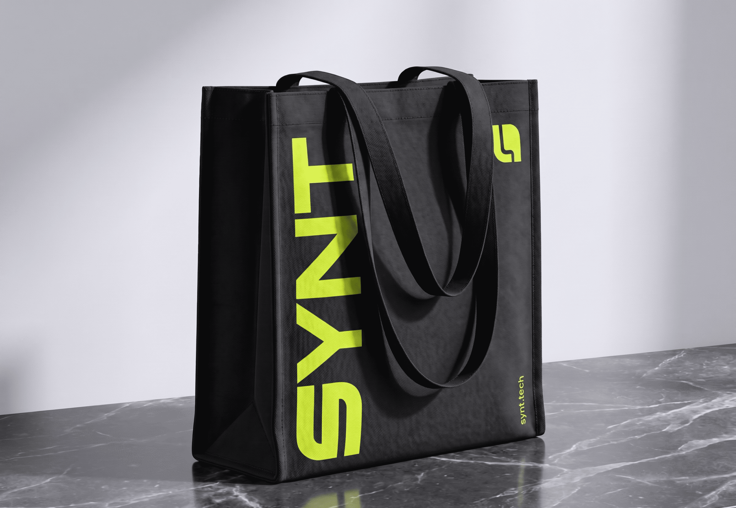
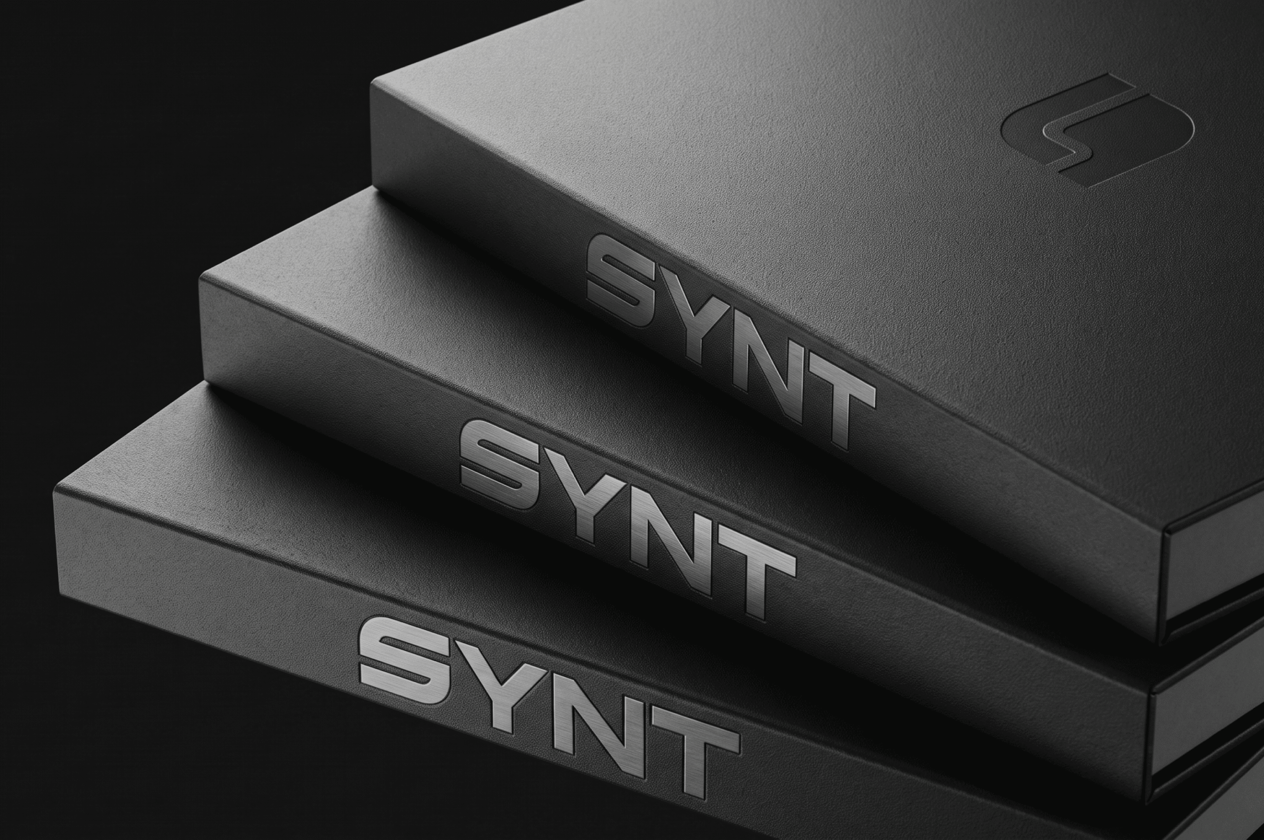
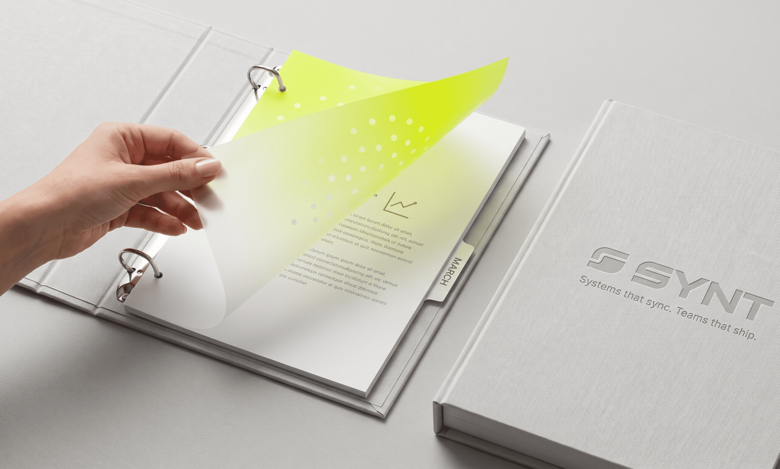
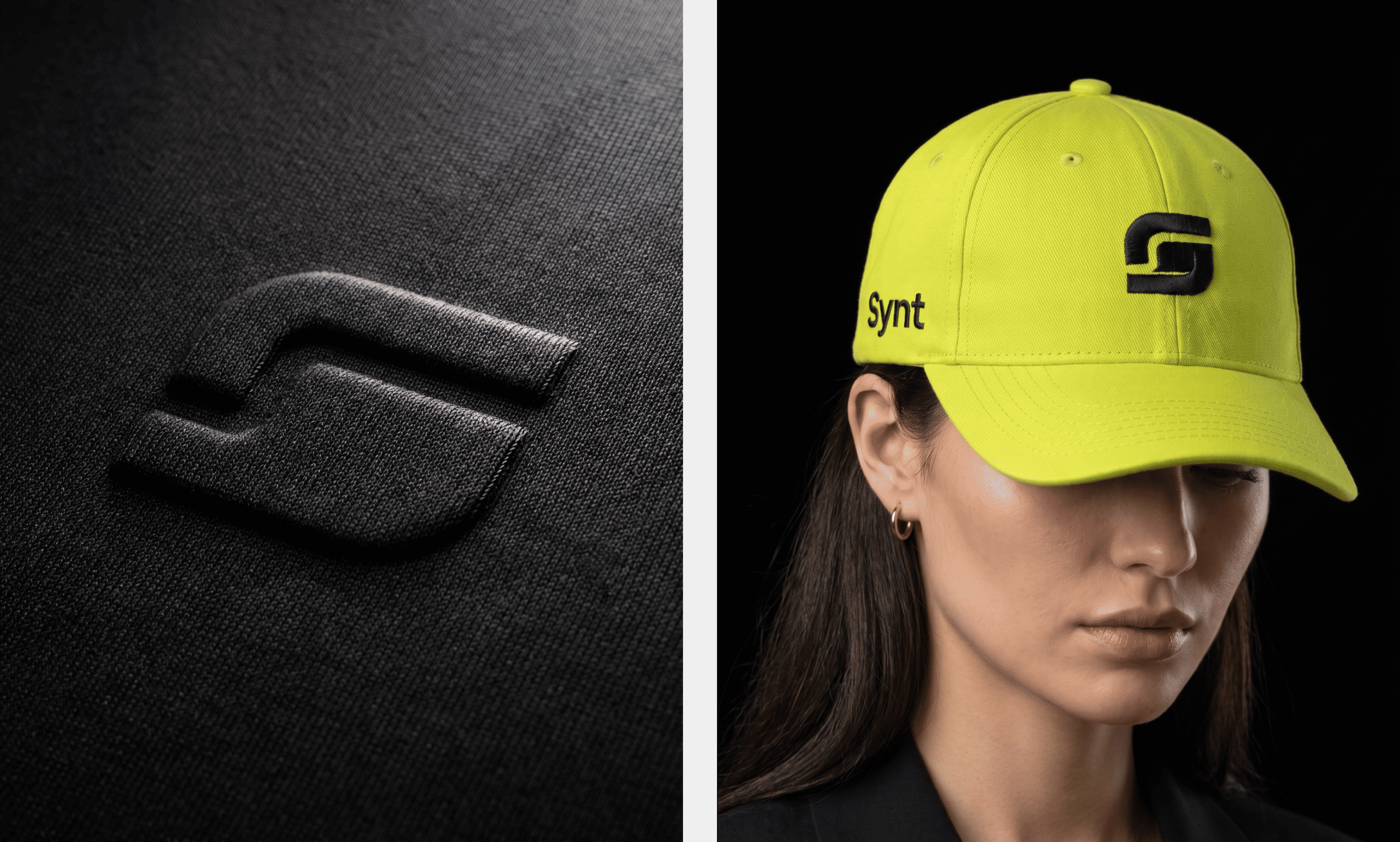
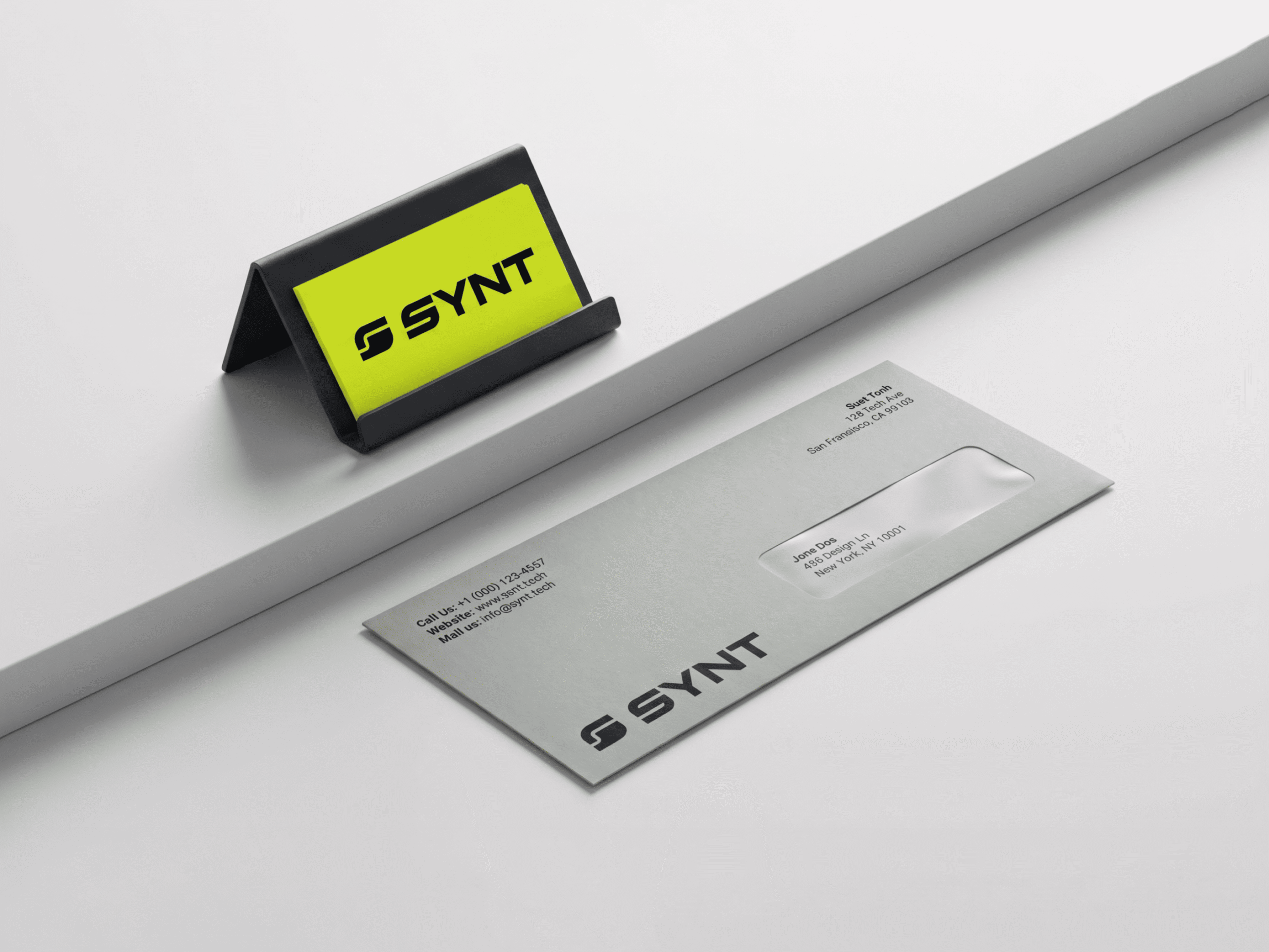
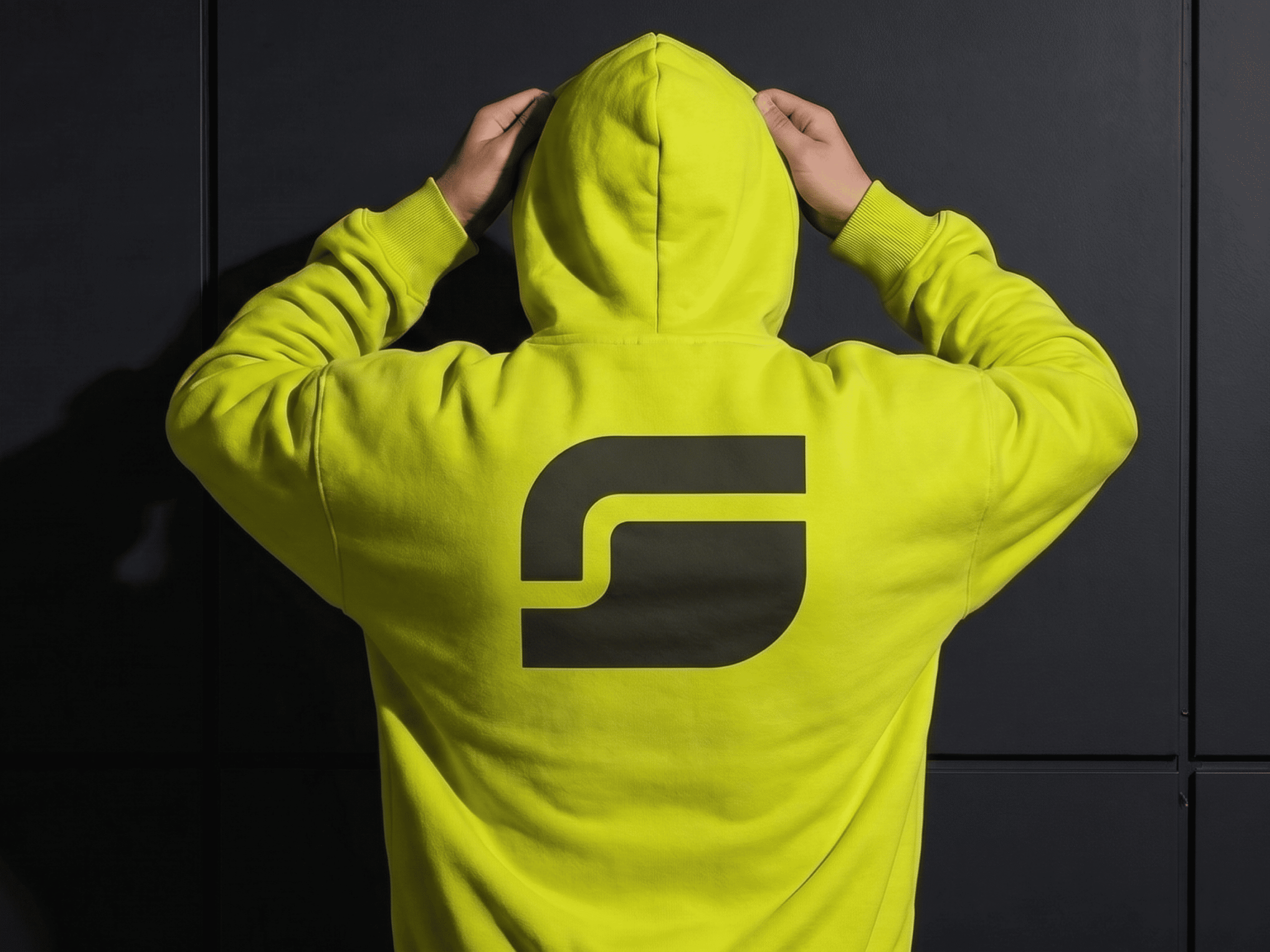
Furthermore, the identity was extended across a full suite of brand touchpoints, including business cards, packaging, apparel (caps and hoodies), water bottles, tote bags, stage signage, and stationery. Consequently, SYNT maintains consistency whether it shows up on a laptop screen or a conference stage.

Visual Identity
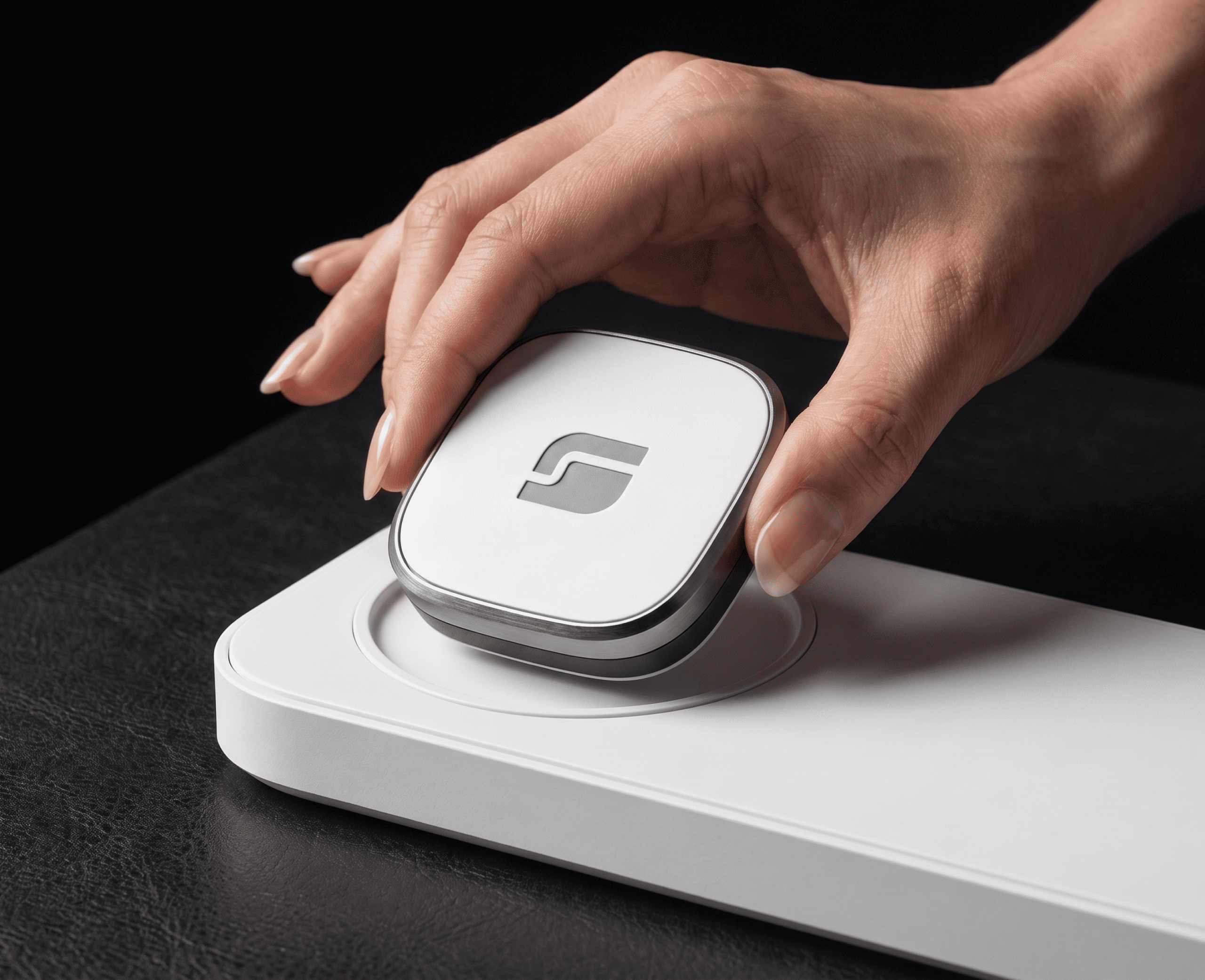
Logo & Logomark: A minimal, angular “S” symbol built for scalability across app icons, merchandise, and signage
Results
Overall, the final identity gives SYNT a distinct, memorable presence. It’s bold enough to stand out at a trade show, yet refined enough to hold up on an enterprise pitch deck.
Want a brand identity this sharp? Get in touch with Kanvux to start your project.