Latizya needed an identity that felt modern yet welcoming. Because the brand serves clients seeking relaxation and self-care, it also had to maintain a premium, professional edge.
The Concept:
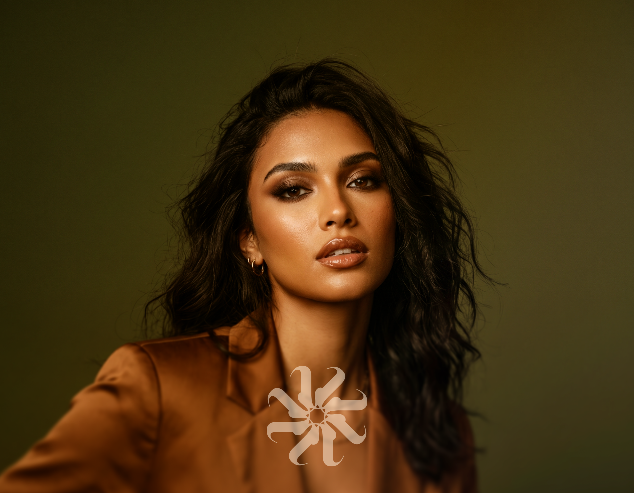
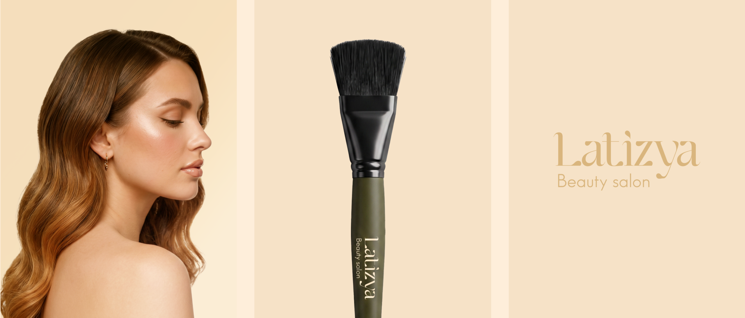
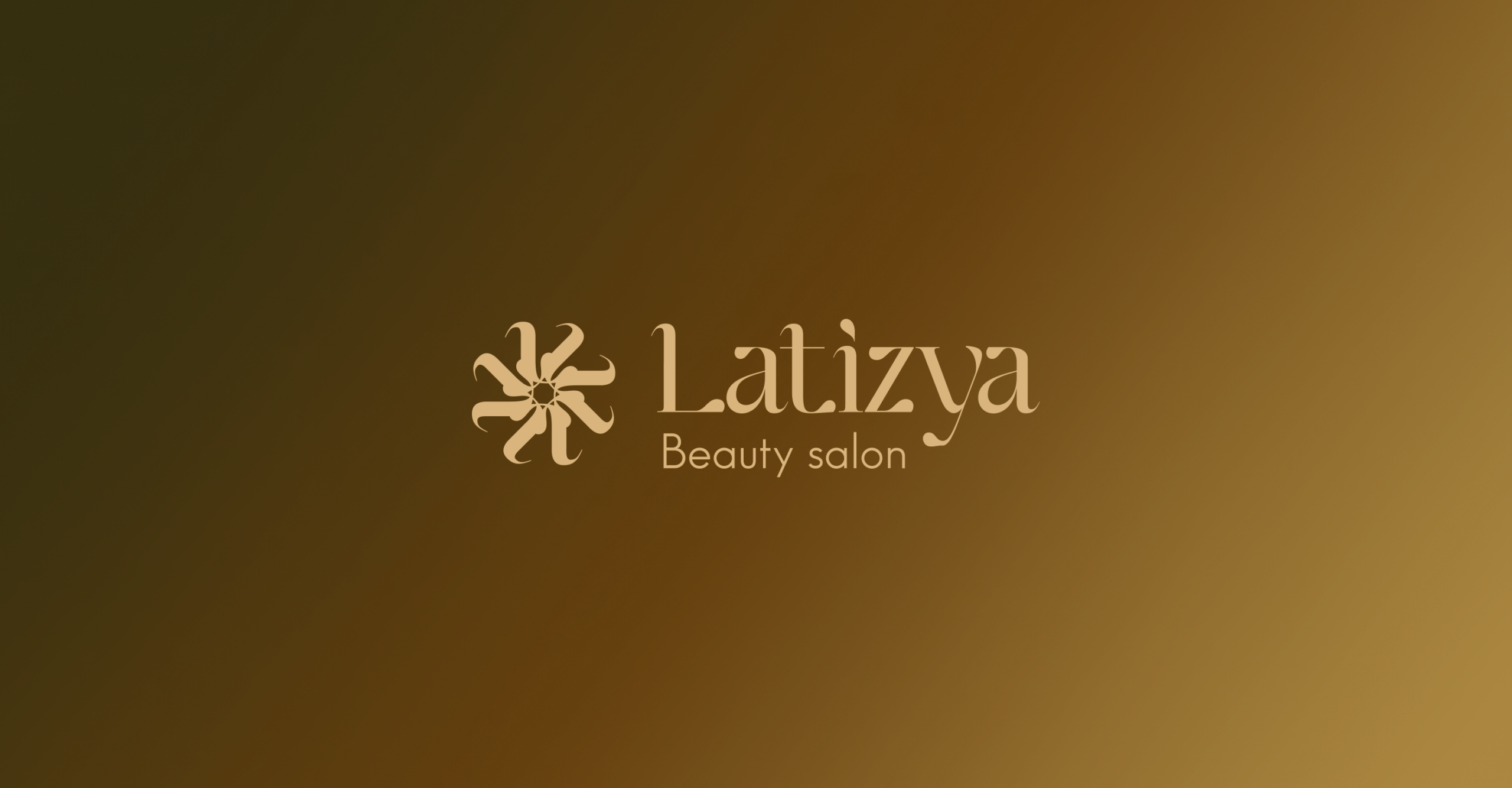
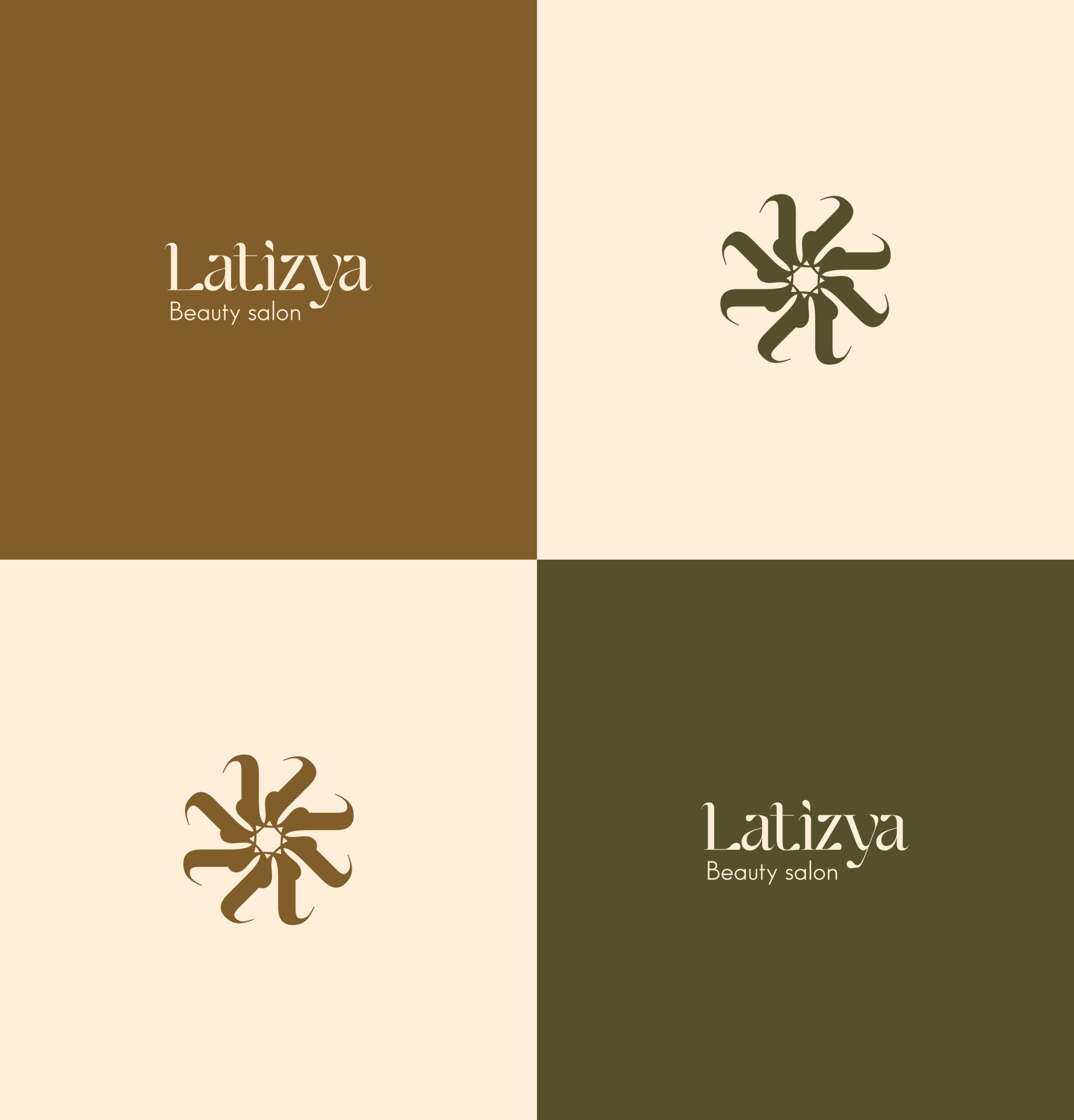
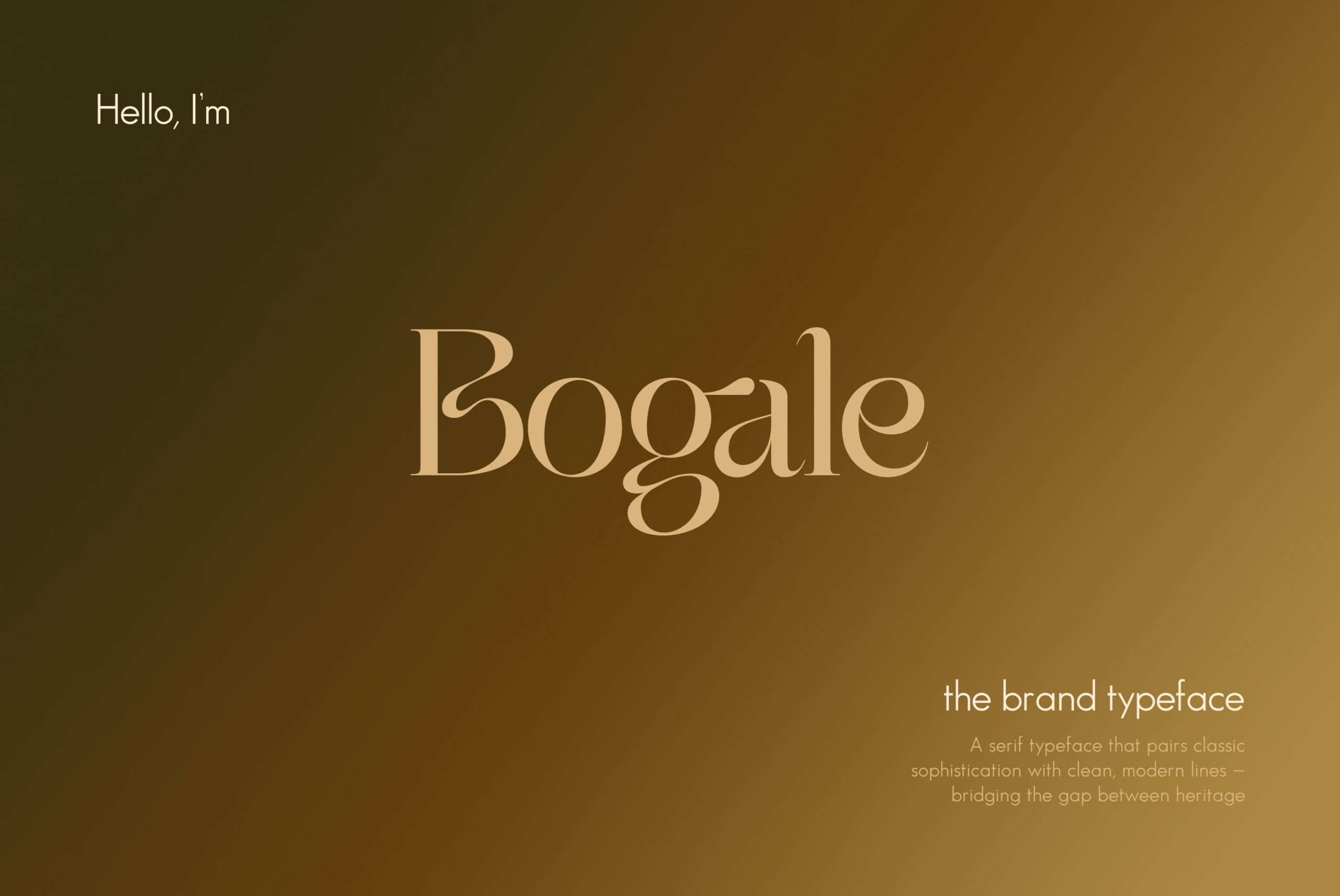
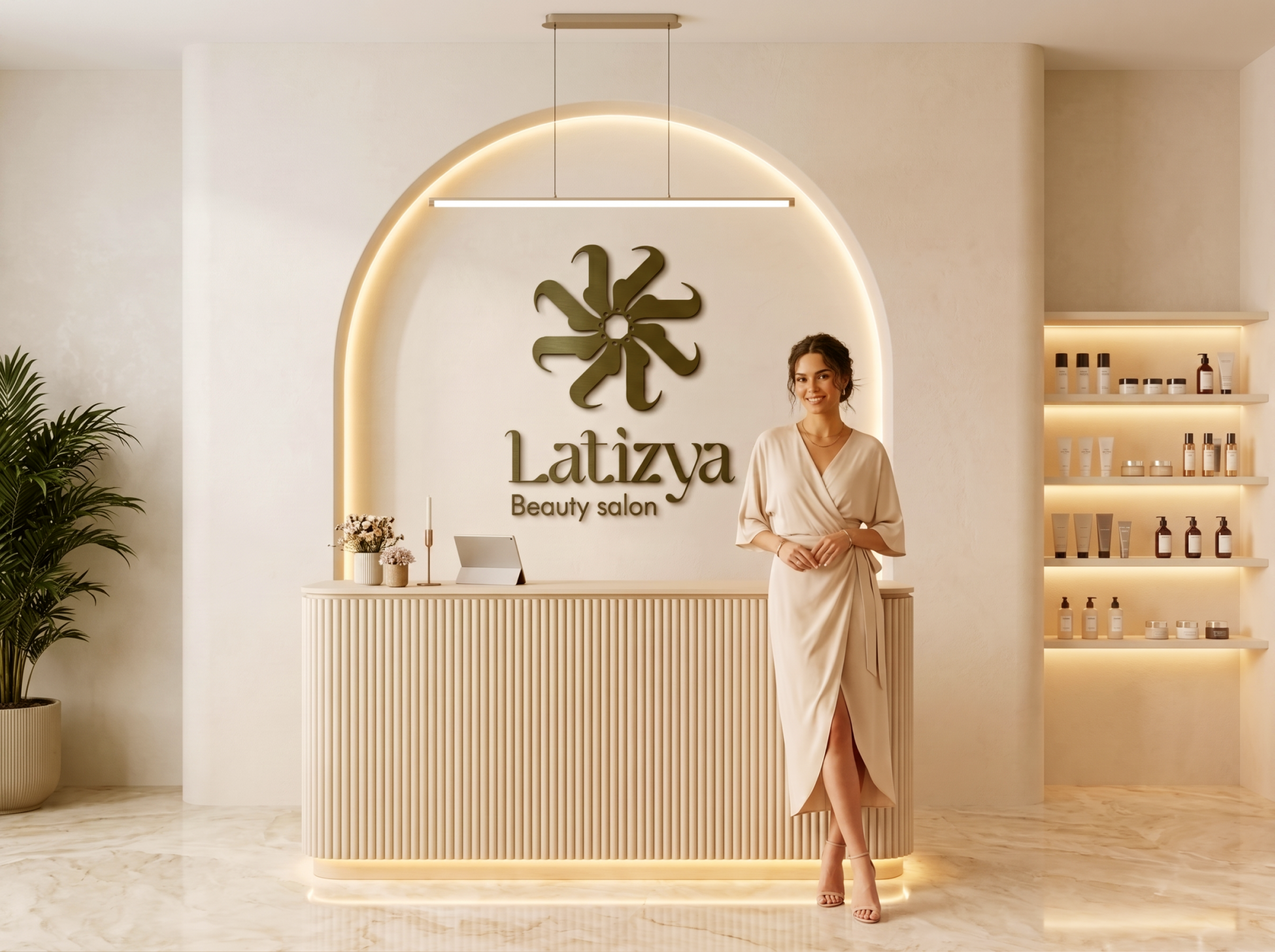
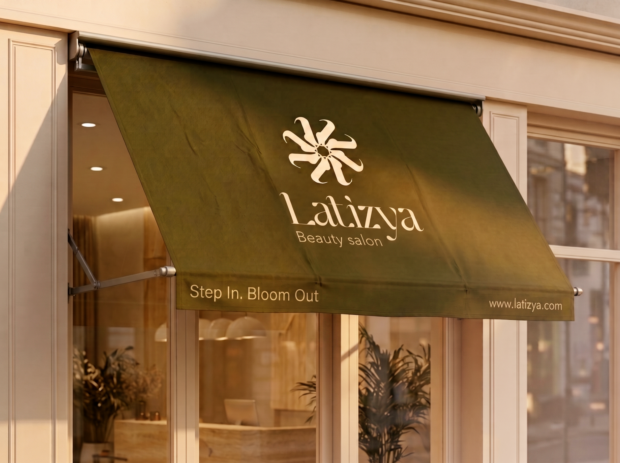
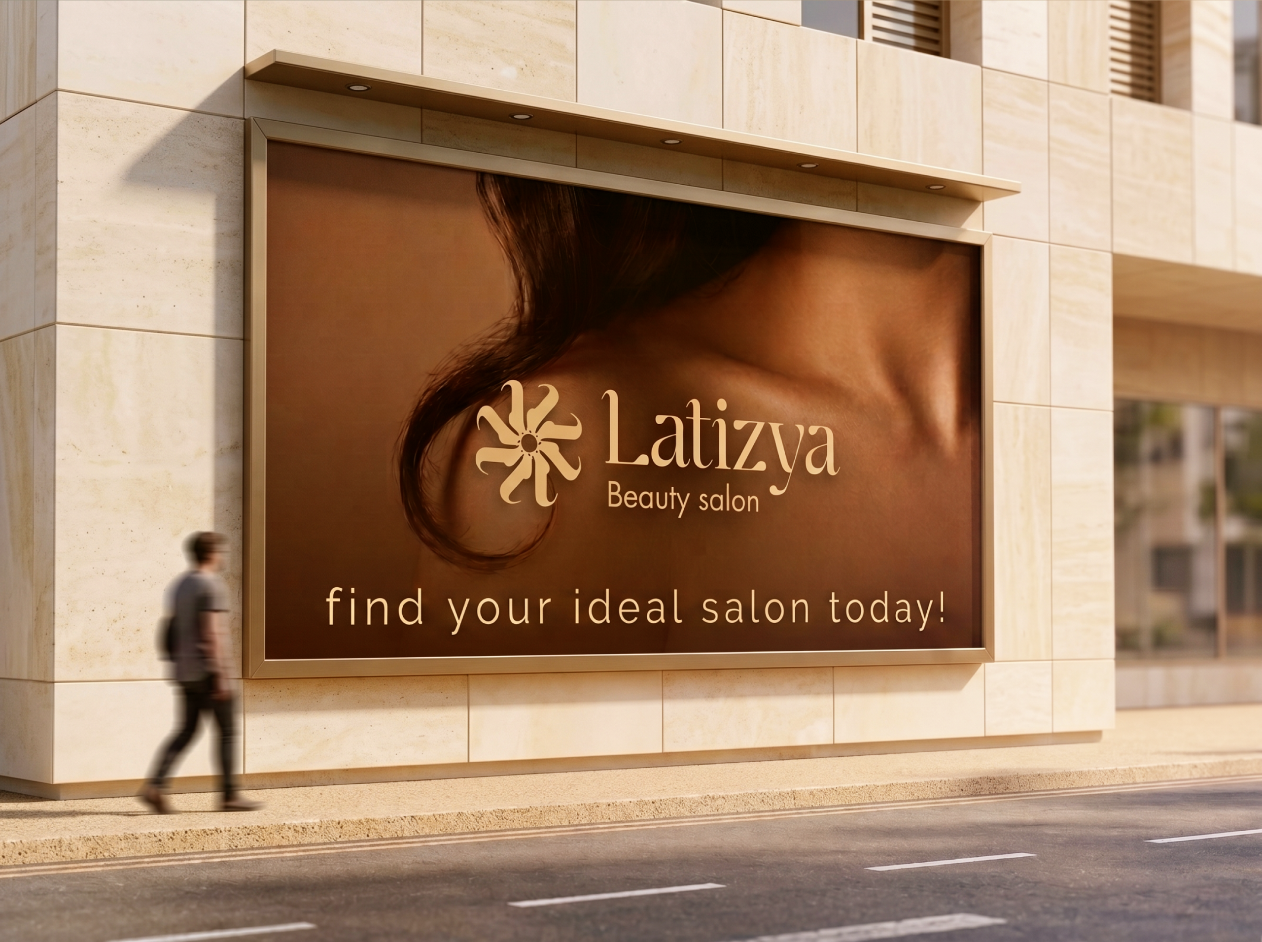
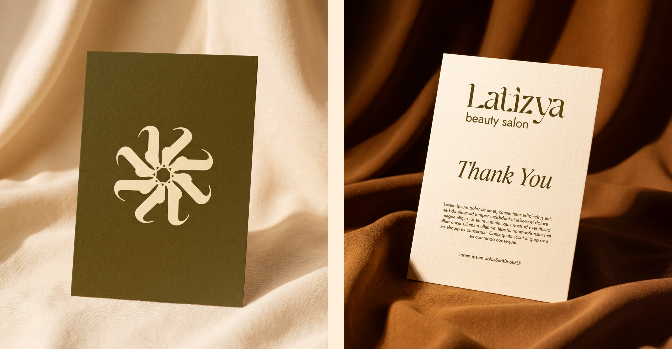
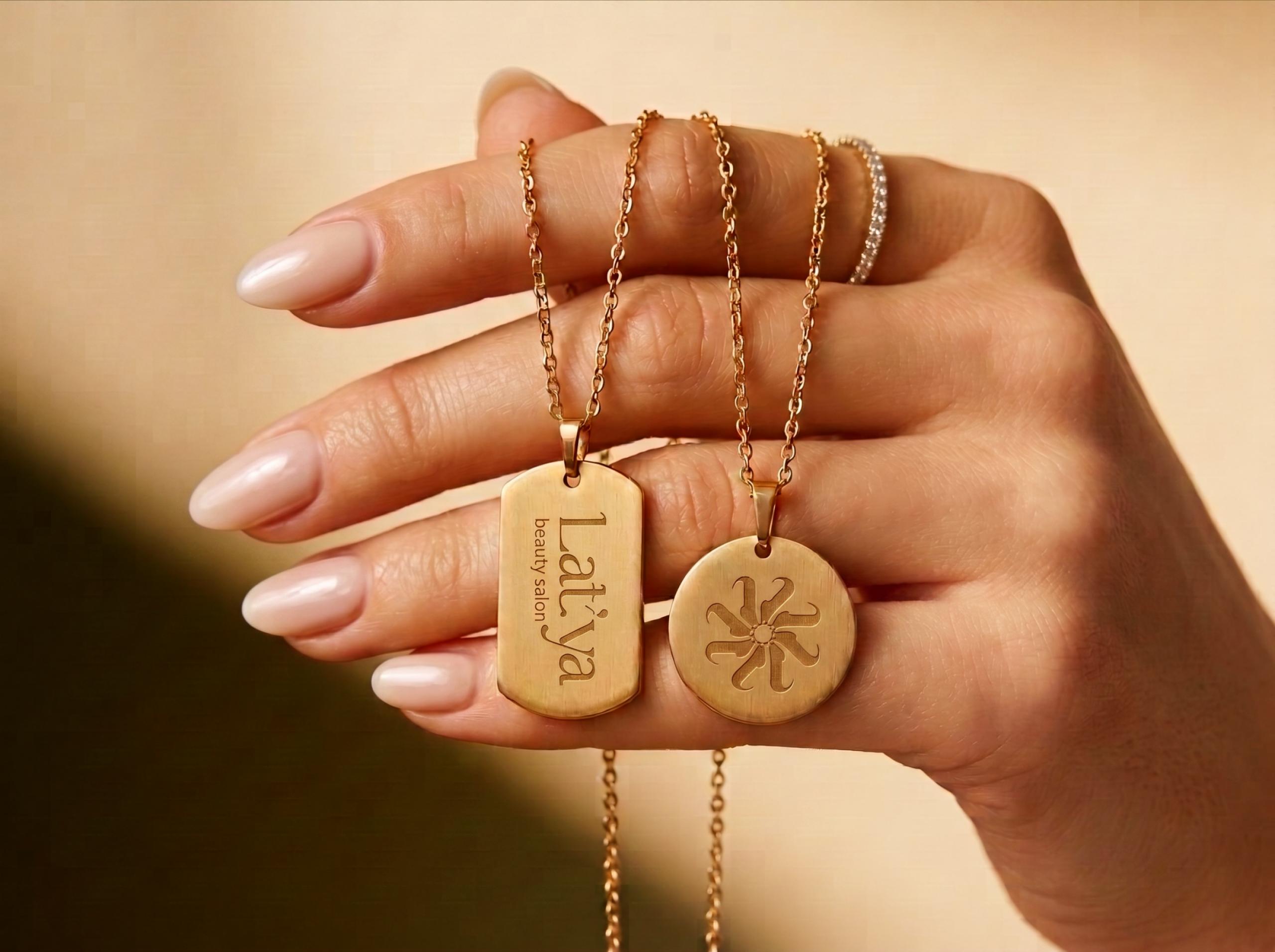
At the heart of the brand is a geometric flower motif. This symbolizes beauty and renewal. In addition, an elegant serif typeface brings a classic, salon-inspired charm to the overall look. As a result, the identity strikes a balance between modern minimalism and timeless femininity.
Color Palette:
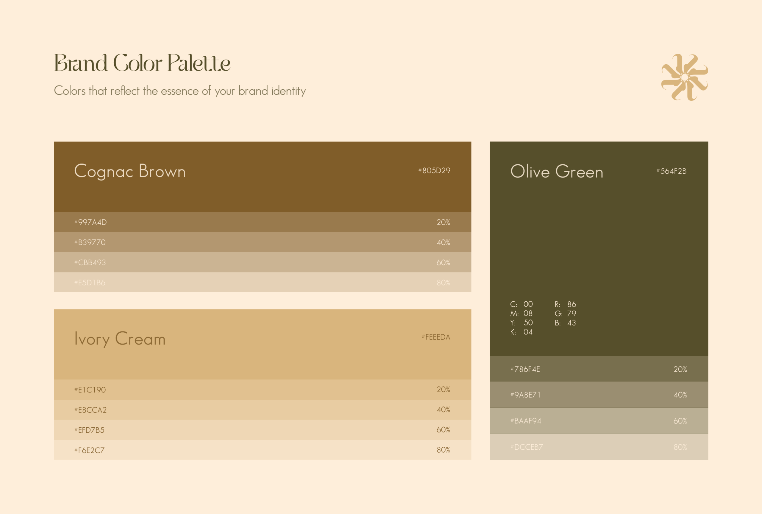
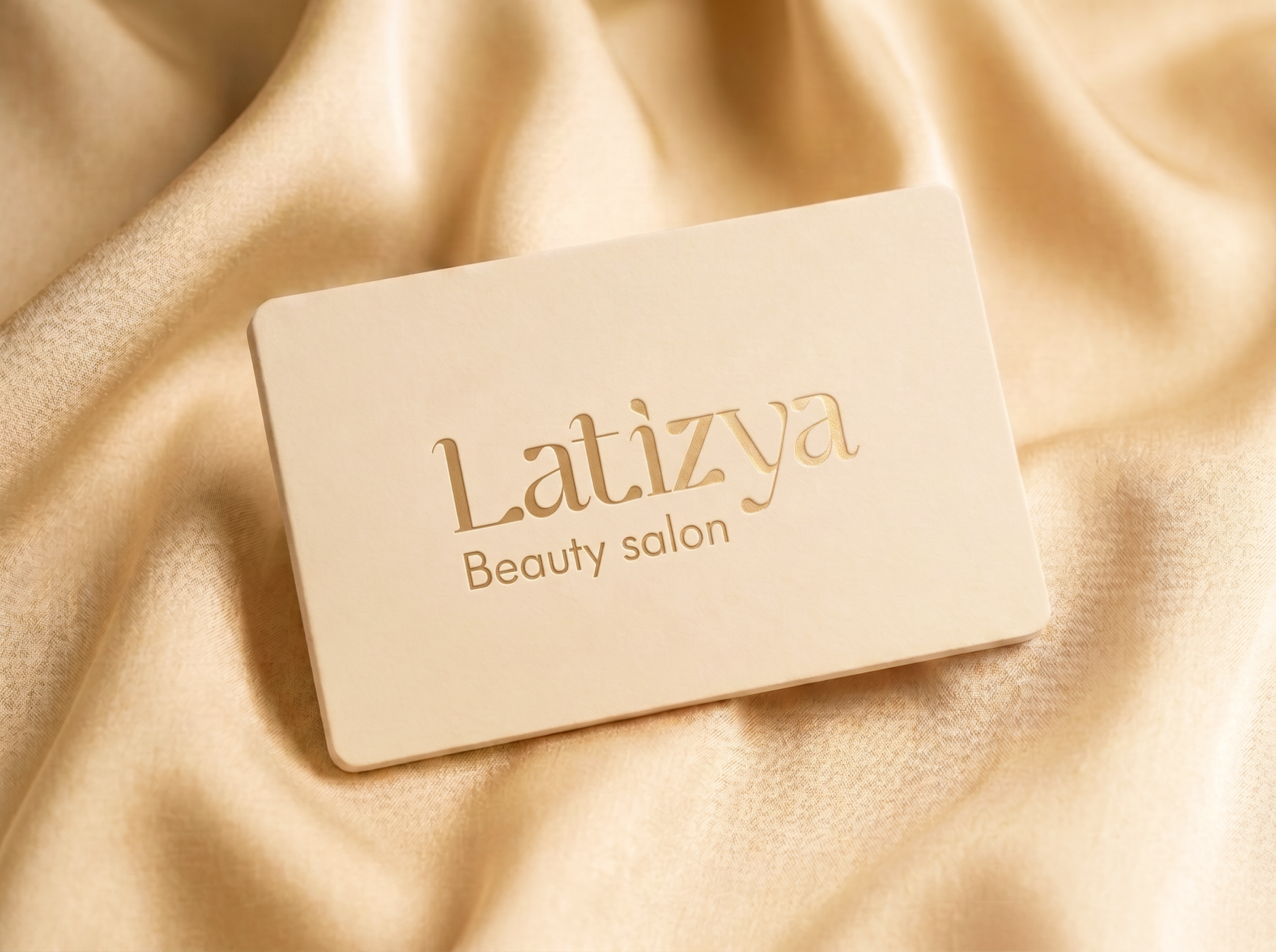
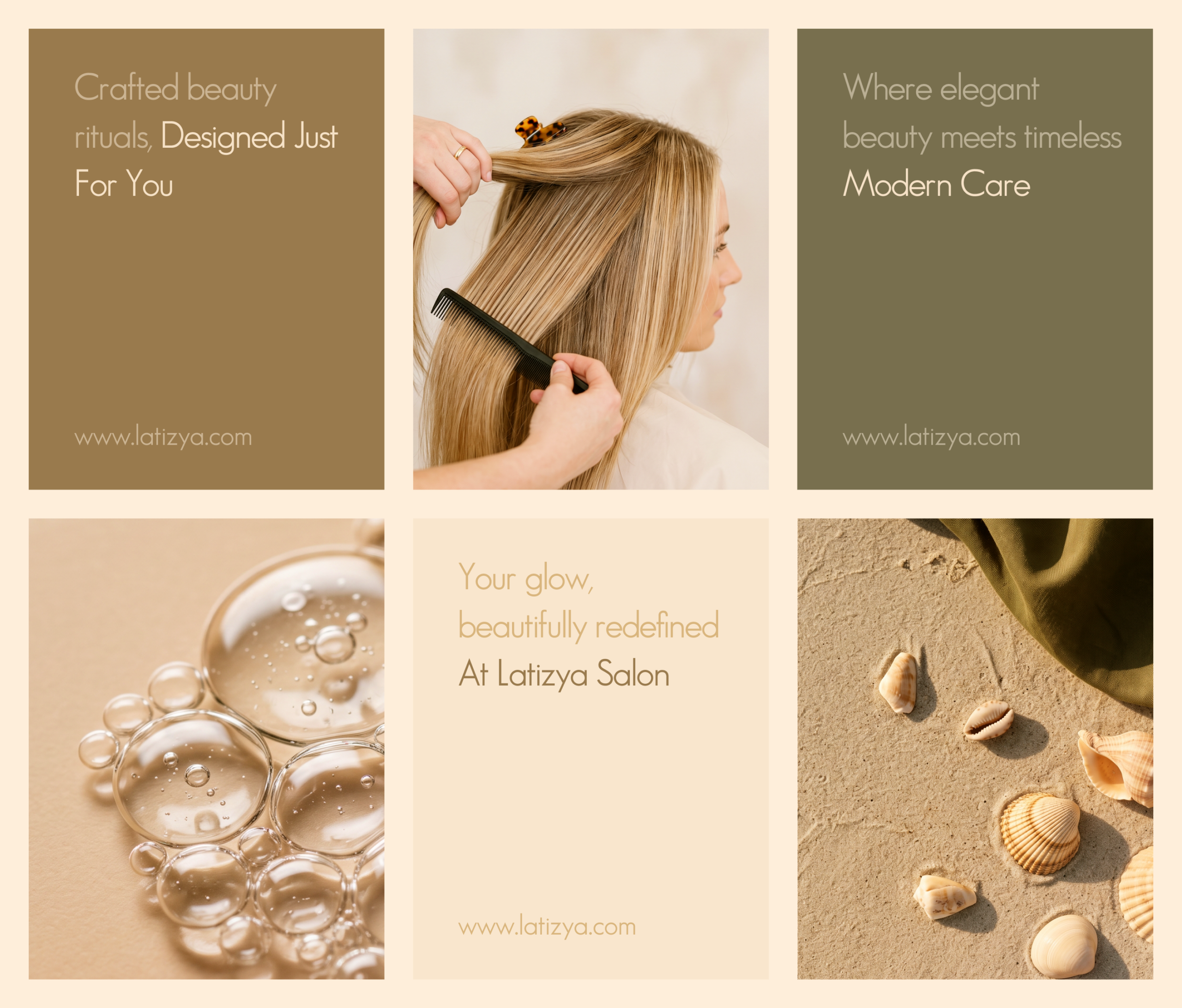
The palette draws on warm beige and deep olive green tones. These were chosen to evoke calm, nature, and quiet luxury. Together, they create a soothing, sophisticated feel. This feeling carries through every brand touchpoint.
Deliverables:
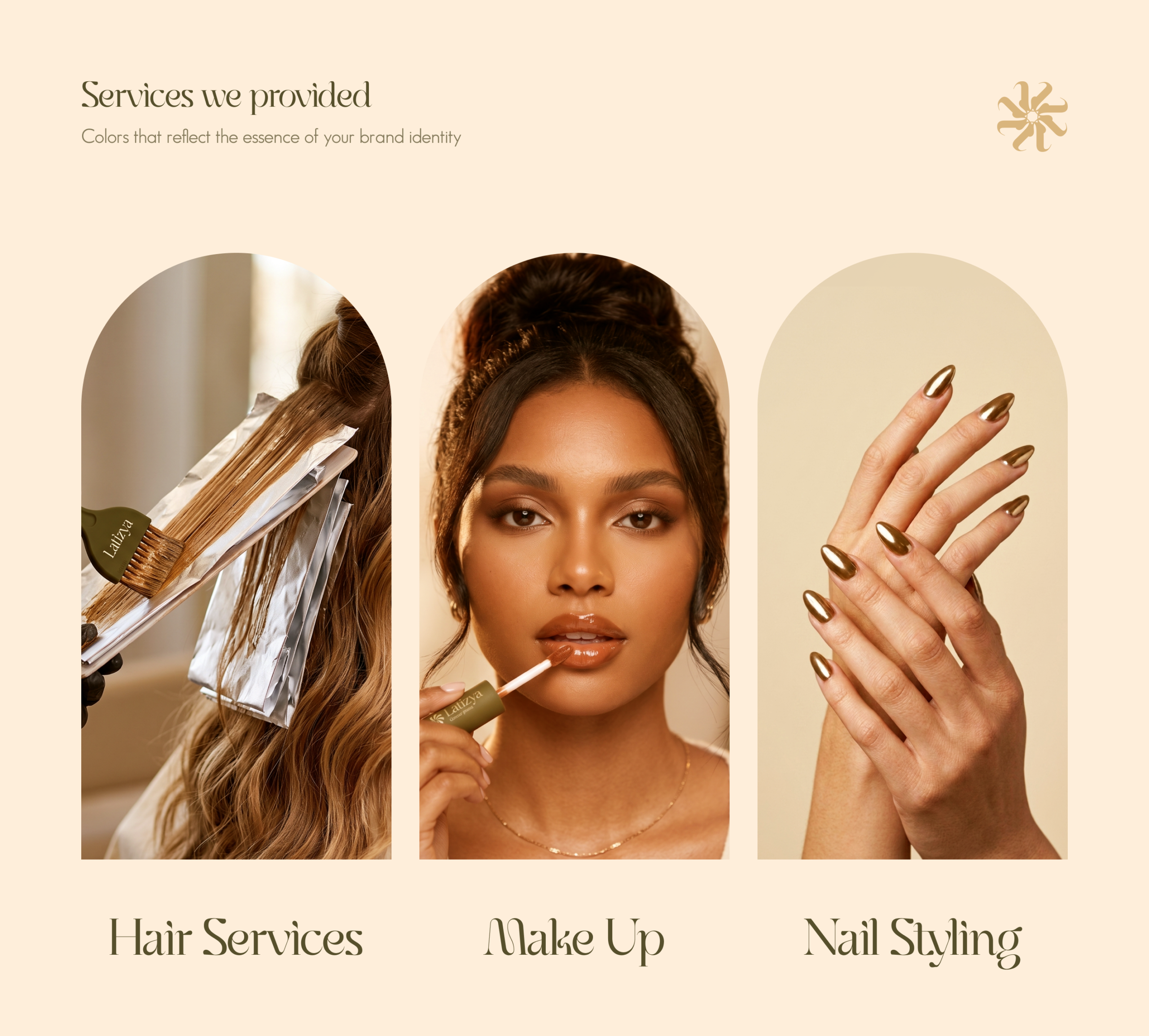
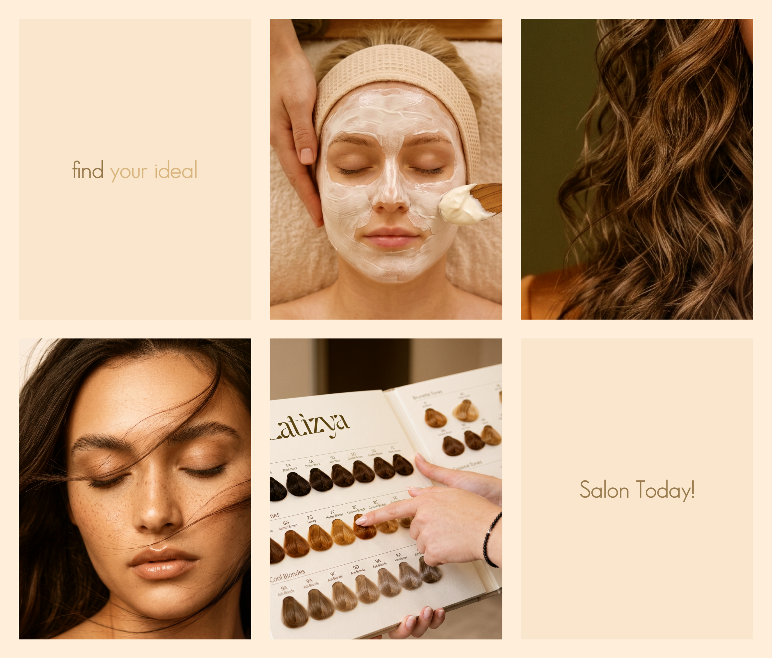
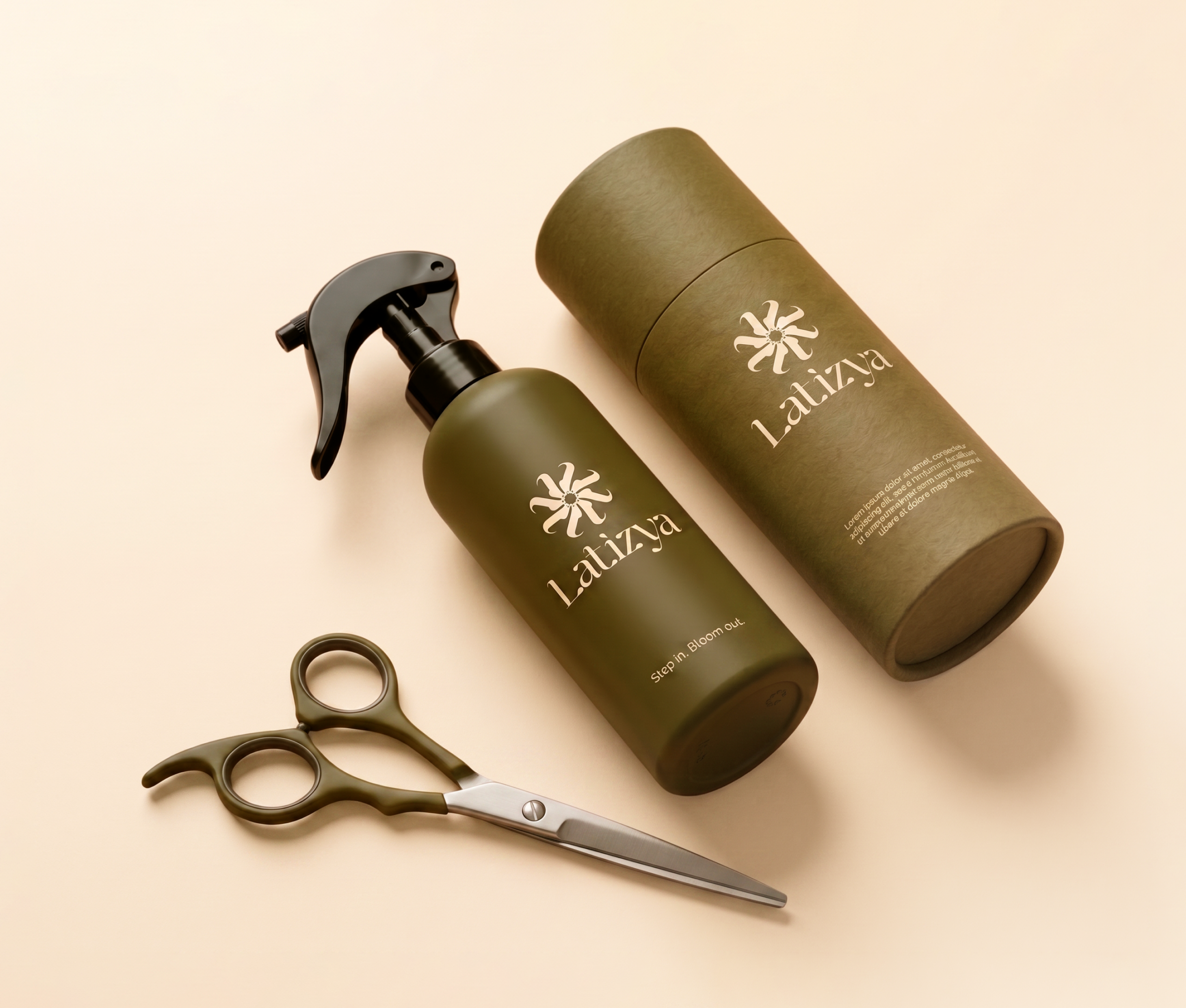
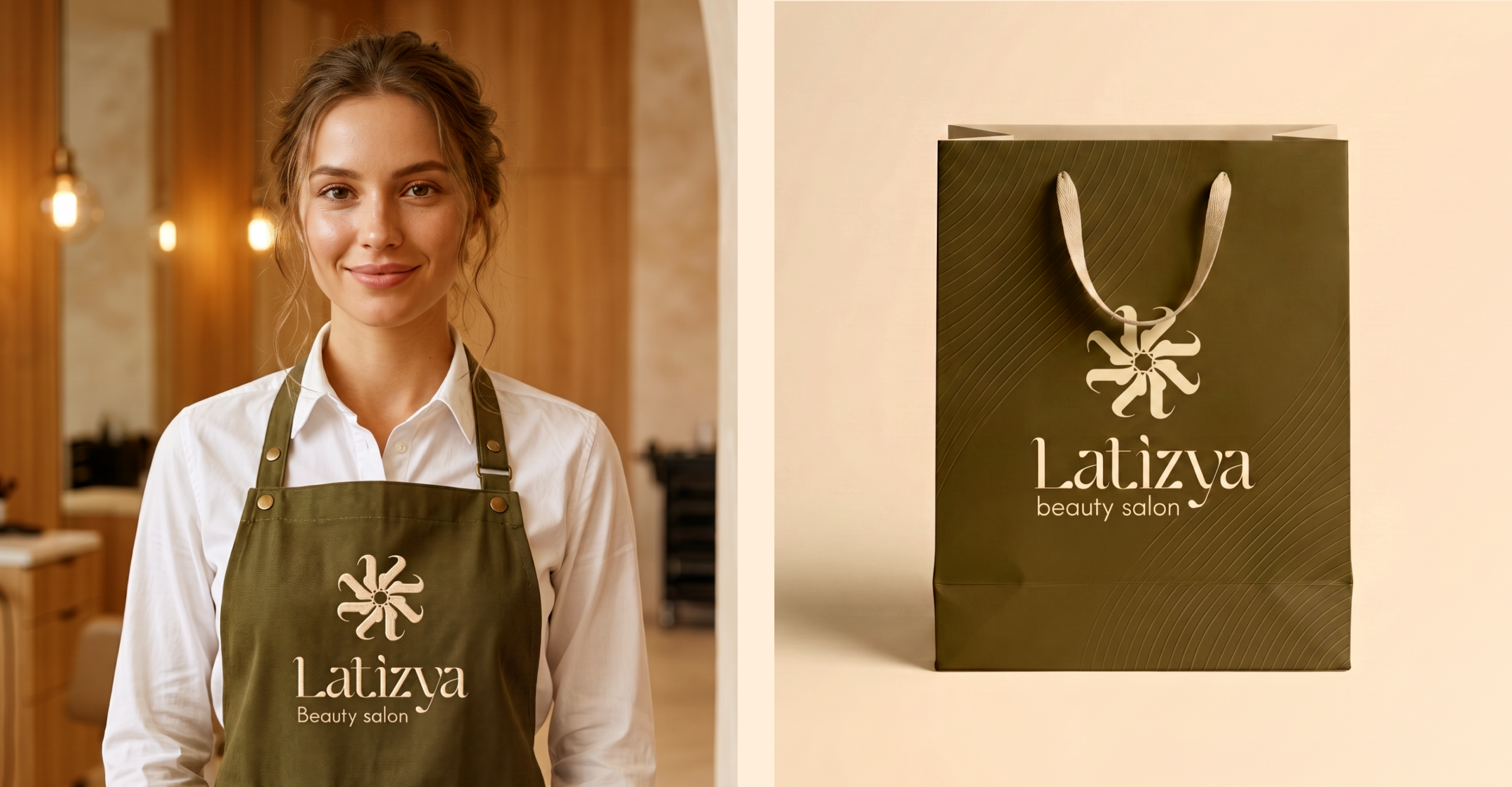
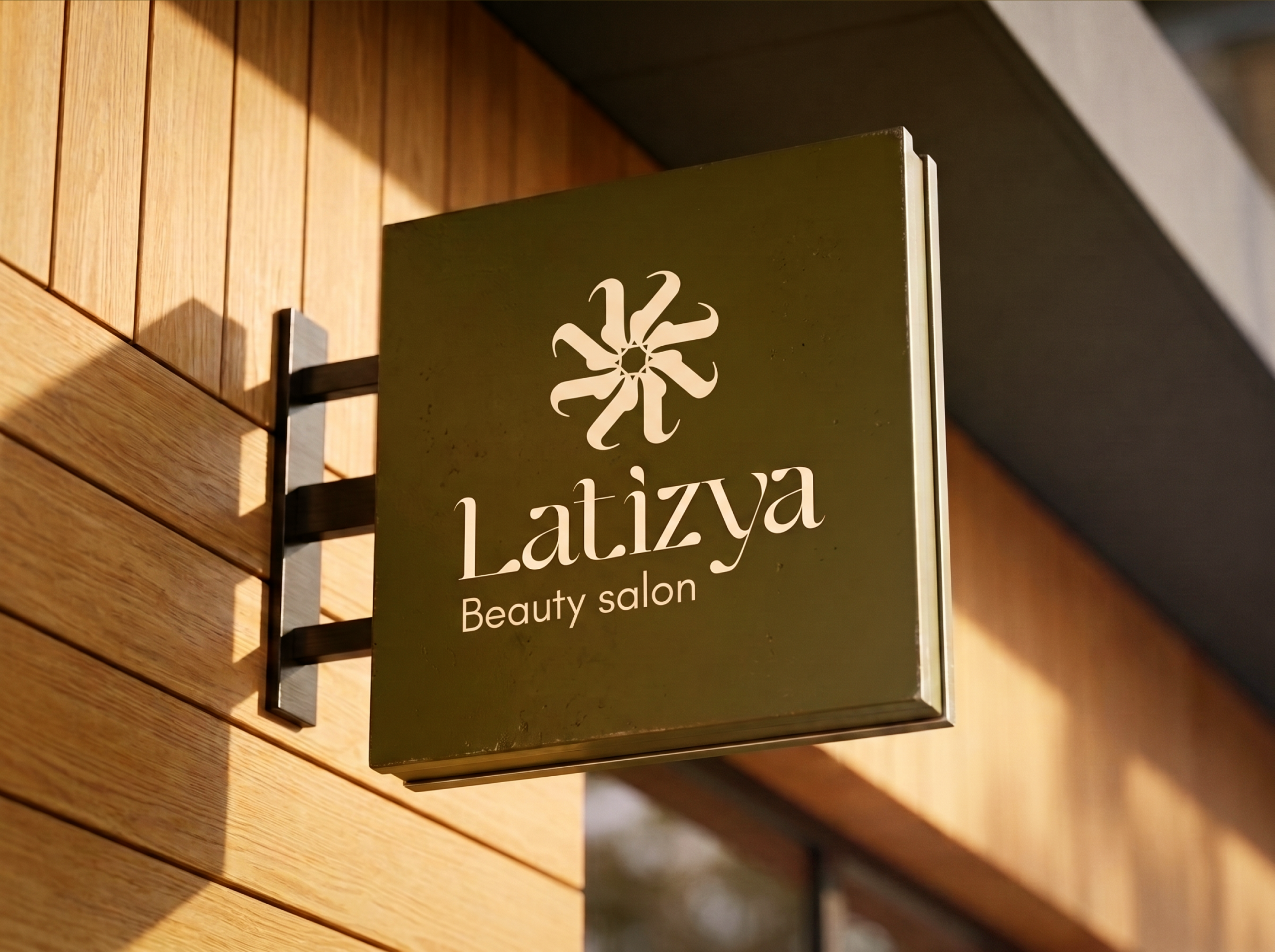
The project included a primary and secondary logo, brand mark/icon, color palette, and typography system. It also included a full set of brand applications, such as social media templates and signage mockups.
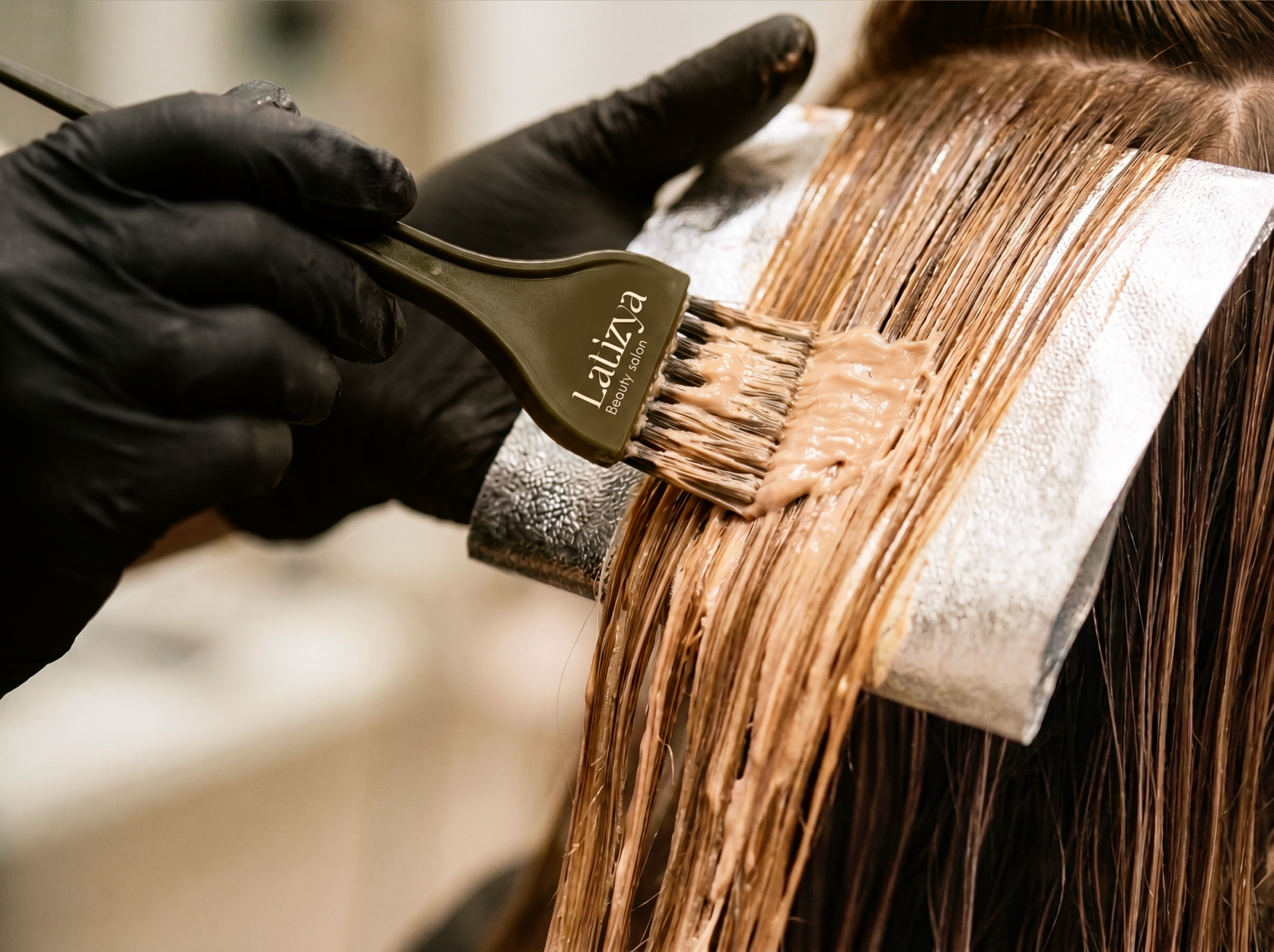
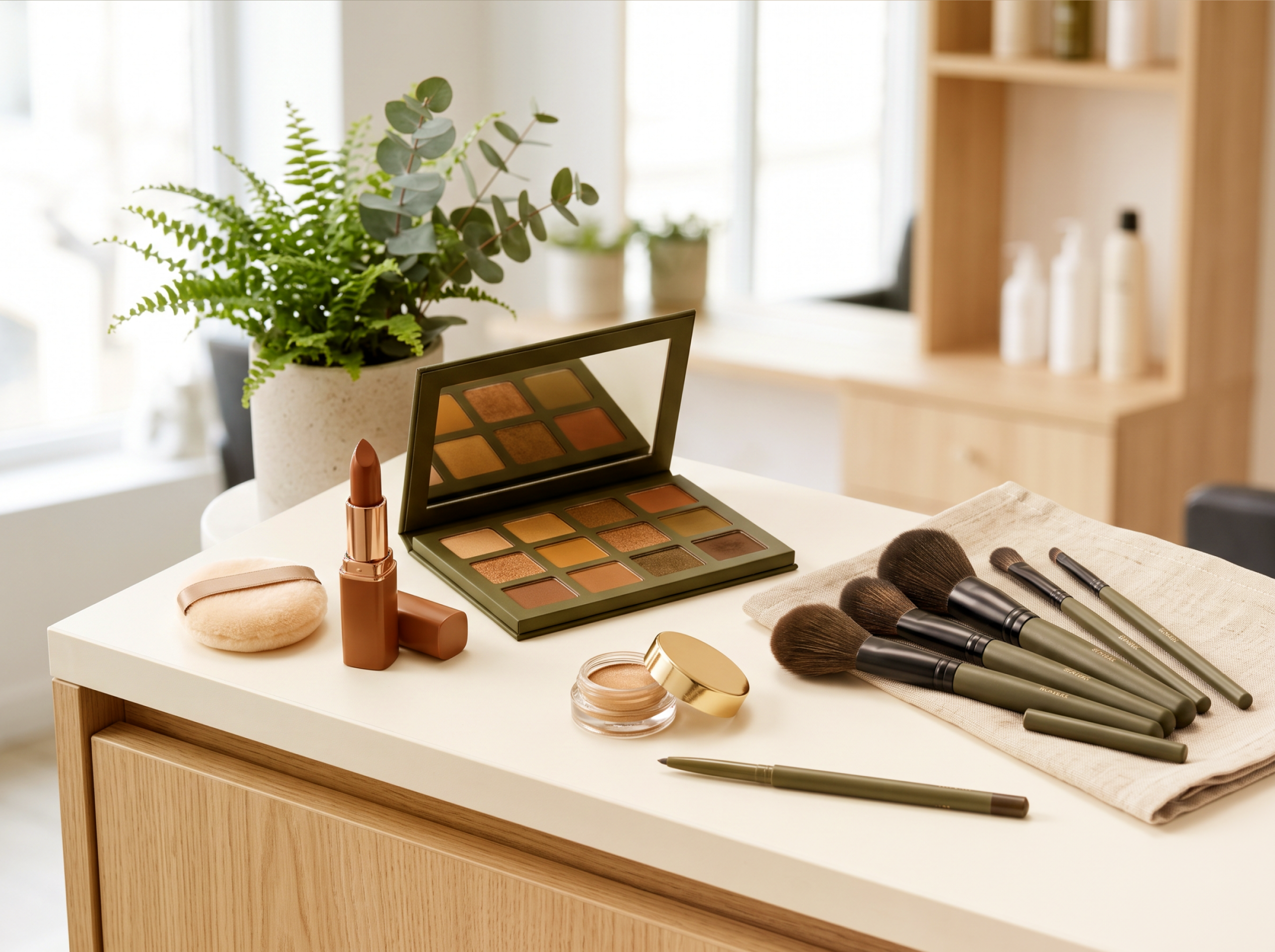
The result is an identity that flows effortlessly across both digital and print. Therefore, Latizya Beauty Salon now has a consistent, elegant presence wherever clients encounter the brand. Every element — from the logo to the packaging, signage, and staff apparel — was crafted to create a cohesive experience. However, the goal wasn’t just to design a beautiful identity. Instead, it was to build a brand that feels genuinely inviting, from the moment a client walks in to the moment they leave with their glow beautifully redefined.